Highlighting Our Crop Winners!

Today I would like to take a moment to say thank you to everyone who participated in our Anniversary Crop. We couldn't have done it without you!! The members are truly what make A Million Memories a special place to be. Michelle will be getting those prizes out to you as soon as possible! So be watching your mailman!! Alright, on with our winners!

GAME WINNERS!
Bingo Winner-Sophia

Blog Hop Winner-Krista Gradias

Scavenger Hunt-Amy Coose

CHALLENGE WINNERS
And now for our challenge winners with a picture of their challenge entry.

Inchie Challenge hosted by Staci Taylor:
The winner is Sherry C. who made this super cute inchie sized home decor item.

Food Menu Challenge hosted by Tonya Dirk:
The winner is Michelle Mangana who created this layout.


Sketch Challenge hosted by Staci Taylor:
The winner is Tagnia Clark who created this layout based on Stacy's sketch.

And our last challenge,
Ad Inspiration Challenge hosted by Jennifer Findlay:
The winner is Andrea Wiebe who created this layout with the awesome hand stitched title.


If you were unable to participate in our crop, you can still view all of the challenges in the crop forum here. As well, there are several tutorials there you may want to check out. Thanks so much for being a part of the anniversary celebration!

December Guest Designer Call!

A Million Memories is on the look out for a guest designer for the month of December 2009. It might just be you! As a guest designer you would receive our monthly kit to design with. Your work would then be featured in our gallery, message boards, facebook page, our blog, and our bi-weekly newsletter, which reaches thousands of customers!

To apply all you need to do is:
1. register on our boards and become an active member; we want to get to know you
2. Post our A Million Memories blinkie on your blog and
3. In an email attach two layouts you think are your best work, a link to your blog and/or your gallery, and your contact information.

Please submit your application by November 15th to me at Jennifer.Findlay@yahoo.com.

If selected you will be notified via email. Good luck!

Technique Tuesday with Tonya Dirk

Today we have a fun video from our Design Team Coordinator, Tonya Dirk. Tonya will teach you about stamping on acrylics then coloring them in. Just click play!


Here are some close up images of how she put this technique into action.

You can see more of Tonya's videos here.

Member Monday with Larissa Albernaz

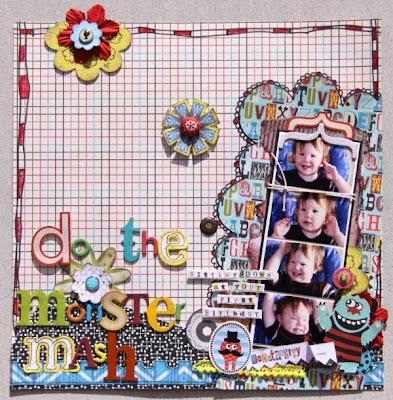
It is a new week and that means a new Member Monday and here to pick our Layout of the Week is Larissa Albernaz. Larissa chose this layout by NicoleP. of her son's first birthday.

Here is what Larissa had to say about choosing this layout. "I love her design, her multiple photos and her tittle work, everything is so fun and perfect that I could not resist."

"Monster Mash" by NicoleP.

Larissa caught up with Nicole do to a little interview to help us all get to know her a little better. So read on to see what Nicole had to say.
1) Tell us a bit about yourself. What got you started in scrapbooking? I’m a SAHM of three munchkins, (4, nearly 3 and 1) so life gets pretty hectic. Married to a fairly understanding hubby who feels neglected at times but understands that mummy needs some crafty time. We live in Central Queensland Australia. I really can’t tell you when I started scrapping. I was always the one at school with that decorated diary full of poems, drawings and messages from friends. Was never shown or introduced, just sort of happened.
2) What three supplies would you not scrap without? Patterned paper, chipboard, pen.
3) What is your favorite part about scrapbooking? For me it’s all about being creative. While there is that element of leaving something for the kids and the future, I just like getting messy and having fun.
4) What are your favorite products and manufacturers? This is just too hard, love so many manufacturers. At the moment it would have to be Sassafras Lass and Prima, finding that I have something from both on everything I’ve been creating. And Webster’s Pages would have to feature in there a little too. Products? Well it would have to be patterned paper. There are so many uses for it and it’s surprising how a little can go a long way.
5) Tell us about scrapbooking [arts and crafts] in your country. Scrapping is becoming a bigger part of Australia. It’s pretty good too because most people have only been creating like this for such a short time. Most people have the mentality that anything goes and there is not much of a stigma on having to do it ‘right’. I love the freedom that this offers everyone.

Leave Nicole some praise here on this post or directly on her layout in the gallery here. Be sure to check out the rest of this Aussie girl's gallery here.

Little Something Sunday with Karen Grunberg

Karen is back today to help all of us non-digi girls get on the bandwagon with a really easy tutorial on how to include shaped text on our next layout or project. So just click play below.

Take it away Karen!

Design Team Challenge Winner

Design Team Coordinator, Tonya Dirk, recently hosted a challenge over on the boards to use a company's logo as inspiration for a layout. The winner was Renee Lamb who did this layout using the Apple logo as her inspiration and used actual stickers that came with her ipod.

"My Ipod Top 10" by Renee Lamb


Congrats Renee. She will be receiving an awesome RAK from Tonya.

On a related note, the design team challenge is on break for the next week to allow you all time to finish your crop challenge projects and get them posted for a chance to win some awesome prizes! So be checking back here next week for a list of winners. It will also be posted on the boards.

November Sneak Peek!

Here is a quick peek at the November kit coming soon! Here you can see doily rub ons from Hambly, brand new fabric Thickers from American Crafts, new stitched papers from Prima, and papers from Pink Pailsee. There is more to come so be sure to watch the boards for more peeks. This one is sure to help kick start your holiday decorations and light a spark in your vintage inspired heart!


Sign up for a monthly kit subscription here and be sure to not in the comments section if you would like to start your subscription with the November kit.

From today through the 29th I will be blogging to you from A Million Memories Headquarters in Long Beach, California! So hopefully we can get some fun "warehouse" and vintage trims and finding s shopping pics posted here for you! Be sure to check back! Hang ten dude! Or whatever they say in California.

October Design Team Reveal Part II

We are back to share some more designs with the fantastic October kit. This time we are focusing on the layouts!


"My Number" by Lucy Edson I love how Lucy emphasized the misted numbers here with the embroidery floss stitching. Fantastic! And the super cute photo sketch is just too darn cute for words!

"Night at the Patch" by Michelle Quinn My favorite little detail here is the ribbon bow and scrunched tails in the corner as well as the layering. Michelle also stamped over top of the Pink Paislee chipboard giving it a distressed look.

"I'm Right Behind You" by Rachel Hall I love this picture and the great mixing of font's in Rachel's title. It adds such great visual interest.


"Oreo" by Tonya Dirk I am in love with Tonya's modern color blocking here and her arrangement of the trio of photos.


"One Thing Won't Change" by Staci Taylor New designer, Staci, doesn't disappoint with this first kit. She cut out all of those little flowers from the Jenni Bowlin paper! And I love the broken line of ribbon. Great design idea.


"The Mill" by Jennifer Findlay I created my title block by tracing one of the chipboard journal spots onto the patterned paper then cut it out. I then placed that on top of dark chocolate cardstock and cut that out to give the title block some more dimension.
"The Gift of Words" by Karen Grunberg I love Karen's simple and clean style which really shows on this layout. I love how she used the Prima packaging to mat her photo and staggered her journal strips.
Check out the rest of the October Design Team gallery here. You can pick up your October kit here.

Technique Tuesday with Mia Caniza

Dimensional Glue
I’m sure you all have heard of this stuff and maybe have used it on some pages. It’s more commonly known as Ranger Glossy Accents, Judikins Diamond Glaze, and Sakura 3D Crystal Lacquer. I’ve had them in my stash for a while and have only recently brought them back out to rediscover the joys of these dimensional glues.


I’ve tried all 3 and my personal fave would have to be the one from Sakura. Why? Well, it’s got a fine tip for detailed projects which is awesome in my book. An added plus is that it dries faster than the other 2 brands. I’ll be showing you a couple projects below where I used some dimensional glue so you can see the effects it has.

On the front cover of my bingo mini album, I used some dimensional glue in the centers of the flowers to give it an added finish. I also used some dimensional glue on the small round Pink Paislee letters, which made them look like they were pebbles.


Here’s another image of the dimensional glue on the circle alpha stickers.


On this page of the mini, I used it on top of the painted Pink Paislee letters, again for a finished look. I also used it on the Cosmo Cricket cut out pencil for some dimension.


Here, I added the glue to the letters on the Sassafras sticker as well as the outline of the arrow.


Here’s a better view of the glue on the painted Pink Paislee alpha stickers.


On my recent “Be Better Than Yourself” layout, I used the dimensional glue on top of some Stickles on this damask chipboard piece. I also added it to the top of painted foam Thickers.

I also added it to the top of this chipboard flower strip and the Basic Grey alphas for dimension.

I hope these examples inspire you to bring out your dimensional glue or to buy some if you don’t have any yet. They are seriously a whole lot of fun and a great way to add dimension and finish your project.

Member Monday with Tonya Dirk

This week's Layout of the Week pick comes to us from Design Team Coordinator, Tonya Dirk. She chose this sassy layout from Sasha.

Here is what Tonya had to say about choosing this layout. "What's not to love about this layout?! Or any of Sasha's work as a matter of fact! She always has so much fun stuff on each layout to feast one's eye upon! Love that the primary colors of this are red and pink, but it doesn't look the least bit 'Valentine-ish'."

Good Spirits by Sasha


Leave Sasha some love here on this blog post or on her layout in the gallery. And don't forget to stop by the rest of her gallery for more inspiration.

Little Something Sunday with Rachel Hall

One of the things that I love about Halloween is the vast amount of digital freebies that are to be found and used in hundreds of creative ways.

I created this little décor piece using a download that I found at Matthew Mead Style.


To create this piece:
1. Download and print the above file.
2. Cut out the pieces and ink edges if desired. I also colored in the letters with orange to accent them and make them pop.
3. Cut out six circles approximately 3" in diameter. Distress if desired.
4. Adhere your cut out download pieces to circles.
5. Cut out six 3 1/2" squares from patterned paper of your choosing. Ink if desired.
6. Cut out one piece of cardstock 11 1/4" x 8". Distress if desired.
7. Adhere the six squares to your large piece of cardstock. Add embroidery stitching if desired. 8. For a quick stitched effect, use a pen and draw stitches.
9. Tie a ribbon around your piece about 2/3 of the way down the piece.
10. Add your round letter elements to your piece. I used foam squares for added dimension.
11. Coat pieces in Glossy Accents or Diamond Glaze if desired for a glossy effect.
12. Place on plate stand for a unique and easy festive décor piece.
Don't forget to check out or free project instruction and freebie digital downloads at A Million Memories, including origional Fall and Halloween themed flashcards designed by our very own Mia Caniza.

Manufacturer Spotlight-BoBunny!

Bo Bunny has sponsored the design team with collection packs from their newest lines. Here is a peek at a few of the collection the designers worked with and more are surely coming.

First up are some designs from Stacy Cohen using "Kitchen Spice".
"Little Dreamers" by Stacy Cohen

"Adore" by Stacy Cohen


Next up is Rachel Hall who used the "Gypsy" line.
"Autumn Adventuring" by Rachel Hall This one was for the Anniversary sketch challenge.

"It's a Daily Thing" by Rachel Hall And this one was for the Anniversary Ad Challenge.


Next, but certainly not last because there are more designs to come, are these Halloween ages by me, Jennifer Findlay. I used the papers from Boo Crew.

"Trick or Treat" by Jennifer Findlay

"Scary Bunny" by Jennifer Findlay
And as luck would have it, Tonya Dirk, our Design Team Coordinator is on the Bo Bunny Design Team. Tonya made this awesome advent calendar sing the "Tis the Season" line.
Check out the rest of the Bo Bunny gallery here and look for more designs coming soon.

Time To Party!!!

Here is where all the cool kids are hanging out!!!

We have mini classes, tutorials on techniques, games, chats, challenges and of course prizes, so head on over!

And if that isn't enough to entice you maybe this sneak of a message board tutorial from designer Rachel Hall will get you over to the party.


It's All About the Mini

This month's kit was all about the mini. The design team went outside the box, or house should I say and created some amazing projects with the Bare Elements house shaped mini. Just have a look below.

In this awesome project, Rachel Hall, took the mini and created a unique piece of home decor. You can find instructions for making your own here.

"Hall Home Decor" by Rachel Hall

Also creating some home decor pieces is Karen Grunberg with these little house panels, sort of a triptych. Have a look below.


The mini album pages weren't just for the home decor though. These designers decorated them and used a page from the mini right on their layouts.
"May Your Path Always Lead You Home" by Lucy Edson
"I'm A SAHM" by Rachel Hall


And for a more concrete interpretation of the mini we have these two examples.
"Cider House" by Jennifer Findlay
You can see the rest of the pages here.
"If These Walls Could Talk" by Tonya Dirk
You can see the rest of her pages here.
So there you have it, the mini album interpreted three ways. If you are not a mini album maker, think about how you can use those mini album pages in other unique ways.
October kits are still available here.

A Million Memories Anniversary Crop Sneak

We have some really great challenges, tutorials, games, and prizes planned for you so be sure you have your trimmer at the ready and your calendar marked for October 16-18th. The fun begins on the boards at 9pm Pacific.

To whet your appetite here is a little sneak of the projects we will be sharing with you.


You don't want to miss this crop or your chance at the prizes. All you have to do is be sure to register on the site in order to post your work to the gallery and threads. You can register by clicking here. See you at the party!

We Interrupt this Technique Tuesday....

to bring you a very special Design Team Announcement!! A Million Memories Design Team is proud to announce that we have two new designers joining us.

The first is Jeni Boisvert. Here is a little more about her in her own words. "My name is Jeni Boisvert, I live in the beautiful state of Idaho with my husband and kids. My dream job is to be a fashion photographer and travel to exotic beaches all over the world. My idol is Audrey Hepburn, love everything about her. I drink too much caffeine, eat too many sweets, and always stay up too late! Photography, Photoshop and Paper are my addictions and I am constantly amazed at how far this hobby has come since I started scrapbooking in 1997. I love how it keeps evolving and changing into something more beautiful and artistic than ever! I have been fortunate to design for some really great companies, and I currently design for Graphic 45, Glitz Design, and Shimmerz Paints Education Team. I am over the moon excited to join the AMM family, and can't wait to learn, share and grow with you!

Here is a sampling of her work. I can't wait to see what she does with our kits.
"Back to School 09"

"Bite Me"

"Alluring"


Our next new designer is Kathleen Glossop.

Read on to learn a little more about her. "My name is Kathleen Glossop, and I live in Perth, Western Australia with my [wonderfully supportive] hubby Jason & 2 year old son, Clay. I've been scrapping for about 5 years on and off, but more solidly since Clay was born –scrapping then quickly became more of an obsession than a hobby! I’m continually inspired by the amazing works of art out there; it’s so wonderful to be a part of such a great community and I am constantly learning and evolving. I scrap everyday, love everything bright & funky (especially anything Sassafras!), white space, and am going through a serious doodling phase at the moment. I am so excited to have this opportunity, and looking forward to inspire and be-inspired on this new journey!"

Check out a sample of her work below.
"Sweet As You Are"

"Old Man"

"Peek-A-Boo"


Leave these girls some AMM love here on this post and look for their work coming soon!