October Design Team Scraplift
We have a new design team scraplift to share with you and this time around we decided to scraplift our very own Michelle Quinn as a surprise for her AMM Anniversary!
Thanks so much Michelle for all you do for us, the design team and the members. I know I speak for all of us when I say this is such an amazing online community and we owe it all to you! You are an amazing woman and a great friend. Congratulations on another wonderful and inspired year!
Alright, now on with the show! Here is Michelle's layout that we decided to scraplift. She used the September kit for this one.
"Growing Up" by Michelle Quinn
And here are the interpretations of the design team.
"The Adventures of Grace & Rita" by Rachel Hall "When I saw Michelle's layout in the gallery, I was instantly drawn to her title work. I loved the mix font and that she wasn't afraid to have a long title, which is something that I love to incorporate into my layouts. To scraplift her layout, I flipped her basic design 180 degrees and of course used a long, mixed font title. I also drew inspiration from how she grouped her embellishments and cut out pieces and added flowers and buttons to my layout. Thank you Michelle for sharing your inspiring and beautiful layout with us!"
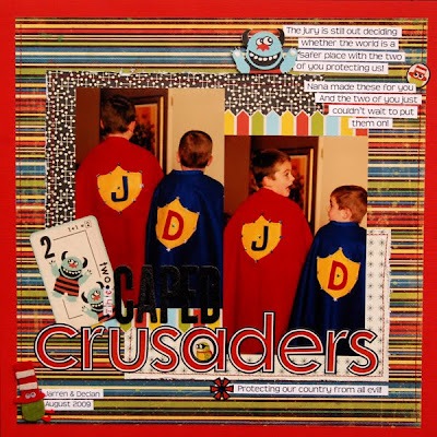
"Crusaders" by Tonya Dirk "I was inspired by the two groups of embellishment clusters that she used in the upper right and lower left hand corners. Michelle's use of different patterned papers for behind the photos worked really well with my photos too to help set them apart from the background paper."
"Lucky Boy" by Karen Grunberg "I was inspired by Michelle's collection of flowers on the bottom right corner and the little journaling strips :) "


2 comments:
Awesome lifts of a special lady's beautiful layout!
gorgeous job on the lifts, gals!!!
Post a Comment