January Sketch Layouts
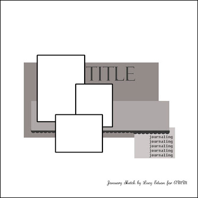
Today we are going to take a peek at what the design team did with the sketch designed by Lucy Edson.
Here's the sketch.

First is Tonya Dirk's interpretation. Not only do I love the paint splatters, but Tonya eliminated a photo and replaced it with a title block to make it work for her.
"O-gurt" by Tonya Dirk
Next is this pictureless layout from Sasha Holloway. I love her use of the Webster's fabric swatches as the focus instead of an embellishment.
"So Many Changes: by Sasha Holloway
"Scenes from the Mall" by Jennifer Findlay To make the Thickers work for my layout, I peeled the glittered tops off, painted them, then put Glossy Accents over top.
"Soar" by Stacy Cohen Stacy added more pictures in a band that stretches across the page but the real highlight here are the beautiful clouds and balloons at the top of the page. Gorgeous work!
Next is this layout from Jeni Boisvert. I love that she didn't take eh sketch too literally and centered all of her elements on the page.
"You Make Life More Beautiful" by Jeni Boisvert
To see more work from the design team using January's kit check out the Design Gallery here.


No comments:
Post a Comment