May Guest Designer Reveal!!

I am so excited to announce our May Guest Designer is Anabelle O'Malley! I first met this adorable lady at CHA this past winter in California and she was sweet as could be when I cornered her and told her she just had to guest design for us! I adore her beautiful style and her cards are always stunners I am sure you will agree.

So please join me in welcoming the lovely Anabelle to our team this month. Read on to learn a little more about her and to see some samples of some of her favorite projects!

Hi! I’m Anabelle O’Malley! I live in Delaware with my husband and our seven year old son, Ryan who is generally the subject of my scrapbook pages!


I’ve been papercrafting for the past six years and have loved every minute of it. It truly is my creative outlet. As a child, I would spend hours drawing and making cards for people, so this is just a natural extension of my love for all things paper. Along with creating layouts, I still love card making and trying out new techniques. My creations contain lots of texture and details. I love all things vintage, shabby, soft and glittery.

When I’m not in my scraproom I can be found relaxing with my family, cooking, reading or going to the gym. I hate housework, so every once in a while I have to force myself to do that, too!
I’m thrilled to be working with the incredibly talented AMM team this month! Thanks for having me!


Here is a peek at some of her favorite projects.
"Christmas Flowers"


"Easter"

"Easter Morn"


And here is a peek at a couple of the gorgeous cards she makes!

Say say a big hello and welcome to Anabelle here on this post and look for her May kit creations coming soon to the gallery! I look forward to seeing what she comes up with.

A Last Look At April

Can you believe it is almost May. This year is just flying by! Today I am showing you some of my favorites from the April AMM kit since the kit happened to be named after me.

First is this one from Karen Grunberg. I love the grid pattern she used to layout her pictures and the fact that she made an April kit work for these Christmas pictures.
"Christmas 2009" by Karen Grunberg


Next is this beauty by Kat Glossop. I love the background she created and how she cut up the Prima paper to make mats for her photos.
"Mirror, Mirror" by Kat Glossop


This one from Rachel really makes me happy. I love the canvas and the canvas flowers she made. So gorgeous!
"The Princess & the Frog" by Rachel Hall


Tonya Dirk, does not disappoint with this beauty. I love the folded paper border she created, such awesome texture there. And the grid of pictures is so cute!
"Twinkle Toes" by Tonya Dirk


Last but not least is this layout by Staci Taylor using this month's sketch. I love the black paint splatters against the soft background.
"My Silly Goofy Perfect Love" by Staci Taylor


That's it for the month of April. I am looking forward to revealing our May guest designer to you tomorrow and getting my hands dirty in our weekend long online crop. You must be registered on the boards to post your projects and be eligible to win some awesome prizes. see you back here tomorrow with our May Guest Designer Reveal!!

April Design Team Challenge Winner

Congratulations to our April Design Team Challenge winner-Angie, also known as agutshall on the message boards. This month's challenge, hosted by Staci Taylor, asked you to create a layout based on a sketch provided by Karen Grunberg and to make that layout monochromatic. There were so many great entries, so Staci did a random drawing and Angie won!

She will be receiving a $10 AMM store gift certificate and an assortment of AMM vintage trims with her next order! That is a fun little surprise.

Here is Angie's layout.
"Sonshine"


Stay tuned for an all new Design Team Challenge, a new kit for May and a fun filled National Scrapbook Weekend long Online Crop with prizes and challenges!

Technique Tuesday with Larissa Albernaz

Here you can see some instructions to do this mixed media project using the Avignon Collection from 7 Gypsies. These papers provide the perfect vintage touch to any project. They´re gogeous and perfect for collage! You can find it at AMM store here.


Supplies list:

Gesso
Glue
Hot glue
Gel Medium
MateBrushes of various sizes (thin and thick)
Acrylic Paint (mine is beige)
Distress Ink (tea dye)
Papier Maché torso base
7 Gypsies Avignon paper collection
Embellishments: laces, trims, blings, flowers, butterflies, memorabilia, etc.

Instructions:
First, spread a layer of gesso to the torso´s base.


Then, spread another layer of acrylic paint and cover it with distress ink.

Tear papers of various sizes and shapes from 7 Gypsies Ecriture, Orchestra and Diagram papers and scrunch them to mold.

Adhere them to torso with gel medium.
Now all you need to do is decorate the torso with laces, trims, blings, etc. Finish up by adhering a small square of paper taken from 7 Gypsies "Announce", the one that says "PRIME aux lecteurs pendant 15 jours seulement".

Here it is! A beautiful project.


Member Monday with Kat Glossop

Yay for Mondays and a new Layout of the Week. This week's Layout of the Week was chosen by Kat Glossop. Kat chose the layout below by Rachel Theall, also known as "happay scrappay" on the message boards.

"Beach Buddies" by Rachel Theall


Rachel is a new member to AMM, so Kat did a little interview with her. Read on to get to know this newbie a little better.

1. Tell us a little bit about yourself? I'm a 36 year old wife of 7 years and mother to two wonderful,spirited little boys. I spend my weekdays as a chemistry professor training students to teach chemistry at all levels (pre-school to high school) and doing research on forensic chemistry and chemistry education. The rest of my time I spend with my family, outside or doing crafty things as much as possible. We just planted our first garden and I just taught myself to knit so I can be crafty at times when I can't be scrapbooking. I started scrapbooking in 1998 and seem to have forgotten how to put pages into books in about 2005! (I need to fix that soon.)

2. This LO is beautifully designed - can you tell us how you go about creating a page? Do you know how it's going to turn out or do you just start sticking things down? "Beach Buddies" started off a sketch though it looks very little like the sketch now. There was a section on the sketch where a wide strip of paper was to be placed, I decided to flip that because I wanted to put a sun in. I cut the sun on my Silhouette but I just couldn't get it to look right how the sketch was oriented. So, I went my own way.The cloud paper was a diecut shape from GCD Studios and I wanted to keep the background shape so I cut strips of the pink GCD studios paper to fold and glue behind it to provide enough overlap to glue the entire shape to the background. Then I realized, that the pictures would stand out more if they were on a yellow background. I trimmed out the center of the shaped paper and put the yellow Core'dinations paper behind it. The sketch had a circular frame on the page and I thought the yellow background needed something so I sprayed glimmer mist over a square in the middle of the page. I added the strips of paper to the bottom of the pictures because I wanted to create a sand effect. I had originally intended to use the clouds only around the sun but I liked them spread through out the page and some of them are on foam tape to make them stick out. The last thing I added was the heart. It was just sitting on the table from another page I had been working on. The heart seemed to tie everything together so well and to show how much my boys love each other and the beach. Creating this page followed my normal process, I usually start off with an idea, cutout a bunch of things, move them around on the page, make a decision about one part and glue it down, move more things around on the page,glue some more down until I decide it's enough, and finish with the title and journaling.

The colors are gorgeous, I understand you did it for a challenge, do you take part in a lot of challenge blogs? If so what are your favorite sort of challenges? "Beach Buddies" was created for The Color Room - a new challenge group. I do like to do challenges and I have a notebook I keep for the challenges I want to do. My favorite challenges are color challenges followed closely by sketch challenges. I also like to do challenges where there is a list of items to use. I feel like the color and list challenges help me to mix up my product and use it up. I usually create a few pages from a single manufacturer but then have plenty of left overs that I wouldn't use otherwise. Challenges are a great way to make sure I don't have a lot of really fun products that don't make their way onto a page.

You've hand written on the page, isn't that scary!? You have gorgeous handwriting, do you often hand journal? I always hand write on my pages. I have only a handful of pages that I've ever used the printer for the journaling. So, I don't find it scary, and I like the way it looks. I do think that my writing is a little messy and sometimes have to go over it twice to make sure that it's readable. I should do this with my students' papers, too, because they are always asking me, "what's this say?" LOL


Thanks for sharing with us Kat and Rachel! Be sure to leave Rachel some love on this post and check out the rest of her AMM gallery here.

Little Something Sunday with Rachel Hall

Adding Interest to Framed Patterned Paper
Many manufacturers such as Webster's Pages and Fancy Pants make beautiful patterned papers that have in the design a frame, or images that create a frame or a border around the entire 12"x12" paper. Typically, these papers are so gorgeous that all you need to do is place your photos, embellishments and journaling and you have easily created a beautiful page in no time at all! But sometimes, you want to add a little extra pop to that paper!


To do so is easy! You will need:

Patterned paper with any design that frames it
Exacto Blade or Craft knife
Extra 12"x12" piece of cardstock you don't mind covering up (this is where you can use up that neon orange that's been in your stash forever!)
Adhesive foam strip, squares or dots

After you have gathered your materials, simply use your exacto blade or craft knife to cut out the middle of the paper in one continuous line. Set that piece aside. Then using your extra cardstock, adhesive foam and the edge of the patterned paper create your dimensional border.


Place the adhesive foam on the back side of the patterned paper and then adhere it to your cardstock. Now grab the middle that you cut out of your patterned paper and using your favorite adhesive, adhere it to the cardstock with the popped up frame piece.

Build your page as you wish and wa-lah! A beautiful page that it sure to make people take a second look!

Saying Goodbye to Stacy Cohen

As you may have read on the boards, Stacy Cohen will be leaving the A Million Memories Design Team at the end of this month but assures us that she will still be chatting and posting her awesome work on the boards and gallery at AMM.

Stacy said, "It’s been such an honor to be on the A Million Memories DT for the past year. I’ve had a blast creating with AMM’s beautiful kits and working alongside some incredibly talented scrappers. I am so grateful to Michelle for this wonderful opportunity! Thank you, thank you, Michelle!! I’m still going to be a regular fixture here at AMM, so it’s not goodbye. I can’t wait to see who makes the new design team!"

I asked Stacy to browse through her gallery and pull out some pieces that she really loved creating with our AMM kits and these are some that she called her favorites and I am sure they are some of yours too. So here they are in no particular order.

"Count the Waves" July 2009 Kit


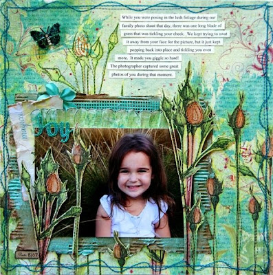
"Joy" May 2009 Kit


"Nature" January 2010 Kit


"Lovely" March 2010 Kit


"Best Friends" March 2010 Kit

We at AMM wish Stacy the best in all of her future scrappy endeavors and look forward to what she has up her sleeve.

April Guest Designer Reveal with Mara-May Baca

I would like to take a couple minutes to thanks Mara-May for being our April Guest Designer. Her layouts are so pretty and I think really show off the APril kit well. I hope you will leave her some love below and join me in saying thank you fo inspiring us this month. So let's have a look.

"1st Easter Egg Hunt"


"Little Soft Fluffy Sleeper"


"Little Baby Silly Faces"


Thanks so much for guesting with us this month Mara. You can leave her some comments on her layouts by visiting her gallery here. We have a great guest designer to reveal for next month but you will just have to wait and see!

Design Team Challenge Update

We have had so many great submissions for our April Design Team Challenge hosted by Staci Taylor, some of which I have already featured here on the blog. Today is the last day to get your submission in to be entered to win a $10 gift certificate to the AMM store as well as a selection of AMM's awesome vintage trims to be shipped with your order! What an awesome prize for doing what you already love to do. SO let's take a look at the entries we have had since last week.

"Hook 'em" by Tagnia Clark


"Hangers? Why?" by SuB


"I Loved You Before I Met You" by robin_f


"Pure" by Nicole Pomeroy


"Lil Sis" by Alyssa


"Sweet Baby" by Karla Smith


"Love Always" by BarbP


Thanks so much to all who participated. Staci will be posting on the boards soon after the challenge closes who the winner is. So stay tuned.

Member Monday with Rachel Hall

Welcome back blog readers. Today we have a new Lyaout of the Week to share and this week's pick was chosen by Rachel Hall. Rachel chose this layout by Leeann Pearce. Rachel said, "The second I saw this layout in the gallery I gasped out loud! The layering is absolutely fantastic and so full of interest from the stitching to the crochet trims that peek out from the layers. It's one of those layouts that you could get lost for days staring at and wondering how it was put together so perfectly!'

"Just Beautiful" by Leeann Pearce


You can visit Leeann on her blog here and see more inspiration from her in her AMM gallery. Thanks Rachel and Leeann!

Little Something Sunday with Karen Grunberg

An Art Journal in the Making

I've wanted to keep art journals for several years. Each year, I'd start them and then end up abandoning them after just a few pages. I put so much pressure on myself and disliked so many of my pages that I simply couldn't get myself to continue. I also did the same thing for regular journaling. So, this year, I decided to combine the two and add in my desire to learn new things. I took the journal I'd used in 2008 (the cover says "Journey" which was my word of the year in 2008) and took out its pages. I added a ton of different sized and textured pages. I put some cardboard, watercolor paper, newsprint, copic paper, the thick paper that was in the 7gypsies journal I'm using, patterned scrapbooking paper, etc. Most of the items came from a Rebecca Sower journaling kit I bought. I then sewed a pouch inside the cover to hold some loose items I might want to use in my journal like doilies, baker's twine, tags, etc. and my journal was ready.
The whole thing started with a challenge Kal Barteski issued about picking a topic and doing it 5 ways in 5 days. I decided to do trees and did 5 pages using different mediums and inspirations. I did a page with Ruth Rae's instructions and fabric, one with oil pastels, one with a photo page inspired by Misty Mawn, some copic coloring, and embroidery. I added to that one that I had made for creative therapy catalyst two out of paper and I had a set of 6 pages to put in my journal.


Then I took out every single inspiring book and magazine I'd bought in the last few years and marked all the pages I loved and wanted to try out. I had books by Ruth Rae, the Artistic Mom, several Somerset Studio magazines, Somerset Apprentice and Art Journaling, and Somerset Sew and Quilting. I played with fabric and paint. I tried to create similar pieces to what inspired me. These weren't for publication, just for learning and practicing so I didn't worry about duplicating style. It also took the pressure off having to come up with something to do everyday.

I also put together all my art supplies that I've bought over the years. My new copic markers, my water soluble crayons, watercolors, oil pastels, etc. And made a list of all the things I wanted to learn/try.I was really afraid to draw. I don't feel like I have any talent in it but I wanted to use my copic markers, etc. I reminded myself this wasn't for perfection. It was for experimentation and for fun and for inspiration. So I drew. I colored. I doodled. I inked. I liked some and I liked others less.

It's been a few weeks and I am falling more and more in love with my art journal. I have now completed around 20 pages or so and I have plans for so many more pages. I am still really excited about my journal and I am really glad to be working on it. And in case you're wondering I am doing the journaling, too.
I think the biggest trick was to go through all my books and magazines and tag pages. Now I have a long list of inspiring things to try and I sit every morning and work on one that strikes my fancy that day. If you're like me and have been putting off making an art journal, I highly recommend this trick. Or at least collecting all your supplies, the papers you haven't been using, the leftover pile and just getting started. The best part about an art journal is that it's for pure play. No one is ever going to grade your art journal. It's just for you. If you want to see any of my pages up close or see what inspired which page, you are welcome to visit the art journal section of my blog. If you have an art journal, please link to it so I can come see yours too. I love being inspired by others!

Design Team Recommends with Karen Grunberg

Happy Saturday and welcome to a new installment of The Design Team Recommends. I think you can totally pick up on the style of each designer just by looking at what products they have picked out from the store as their favorites. Today we are going to take a look at what is in Karen Grunberg's shopping cart.

AMM embroidered lace from the Odds and Ends section of the store.


From My Little Yellow Bicycle's Fresh Print Traveler Collection, Ticket to Ride


From My Little Yellow Bicycle's Zinnia Collection this Floral Ledger paper now only 47 cents per sheet!


American Crafts-Daiquiri Vinyl Thickers are Karen's favorite font to use. These are currently on sale for only #3.90 so stock up!


From 7 Gypsies Avignon:
So head on over to the store and remember domestic orders get $5.00 shipping. So stock up on your favorites!