Scrap Space Solutions with Ro Philippsen

My scrapbook workstation is very simple!!!

There is a glass top desk that fits perfectly where I scrapbook. It is easy to clean, durable, very versatile and gives a fresh, clean and modern look as a craft desk.


This is a cutlery drainer that turned into a scissors, rulers, brushes, pens and tweezers holder. It can hold various scrapbook supplies.


There is a box with some of my creations: cards and mini-books


Acrylic box with my Thickers and alphabets. A big part of keeping a more organized craft room is creating space to store products and grouping different types of items together in easy to access containers. Clear plastic storage boxes are a great way to do this. It is great to find what is inside, without needing to open the box and dig through it.


In fact, there is one more acrylic box which I store my newest papers. A great way to organize my scrapbook papers so that it is easy to find the perfect color for a project.


There are two cute needle-felt cupcakes.

Little Something Sunday with Staci Taylor

I love making mini-albums, however, I don't like the fact that they normally take me so long to do! Today I am going to show you that you can make a quick and easy mini-album using only some scraps of patterned paper, some trims, and a few of your favorite border punches and embellishments.


The first thing that I did was resize the photos I had picked out to 2x3, with the intent to put two photos on each page of the mini-album. Next, I decided on a basic design. In addition to the two photos per page, I used either a border punched scrap of patterned paper or a trim to border the photos (sometimes I layered both). In addition, I added some small chipboard embellishments on most of the pages, too.

I followed this formula for each page, leaving enough room to add my journaling on each page. Lastly, I used chipboard to embellish the cover, and instead of using binder rings, I tied ribbon through the album as I thought it gave it a more homespun feel.


Hopefully this project showed you that it is possible to keep things easy when it comes to mini-albums, and it can still turn out cute :-)

Clearance Sale

FINAL CLEARANCE SALE!
We are heading out to CHA this weekend and still need to clear things out.
TAKE ADVANTAGE NOW!
Use code GOGO @ checkout and take 45% off of your order!

PLEASE NOTE that the sale DOES NOT apply to the January kit, pre-orders or the Websters Pages Spring Market line.

January Design Team Sketch LO's

Are you ready to see what the design team did with this month's sketch? Well get ready. This month's sketch was provided by the talented Zoe Nemburt.


and here are our design team takes.

"Happy Day" by Jennifer Longenecker


"Pink Marshmallow Love" by Tonya Dirk


"Sweet Swaddled Slumber" by Staci Taylor


"Wings" by Marie Ramirez

Design Team Reveal

Get ready for some more awesome and inspiring LO's from our design team using the gorgeous and colorful January kit.

Check out this adorable LO from Staci. Love how she uses the ribbon and My Minds Eye chipboard.

"Sweet Birthday Girl" by Staci Taylor


This gorgeous LO is from Tonya Dirk. Don't you just love her punched hearts. Such a cool effect and what a great way to use the MME brads too.

"So Sweet" by Tonya Dirk


Up next is another of my LO's. I loved the butterfly vine, and decided to add my own little touch with punched butterflies.

"December Moon" by Jennifer Longenecker


And finally we have this awesome LO by Marie. I love how she mixes her colors and plays with the vintage buttons.

"Your Kiss" by Marie Ramirez

Technique Tuesday with Zoe Nemburt


Hey everyone Zoe here and I want you to drop absolutely everything and use your Border Punches!! Well ok don’t drop everything, lol, but we all have lots of border punches. They have become a huge staple in our scrappy supplies in recent years and I find I reach for them for almost every layout.

We have all been seeing more and more punched backgrounds recently. This look is very easy to achieve and adds so much dimension and texture to a layout without it becoming bulky, so for my layout today I punched with 4 border designs and layered them up.

You only need 1 sheet of pattered paper and this looks cool with just plain cardstock too.

Step 1: Cut a 4 x 12 strip off from the edge do not discard this piece as we can use it as an extra border or two.

Step 2: Punch along your 8 inch edge and then trim 1inch from the bottom of the design so if your design is deep then you should have at least a 2 inch strip this makes the layering process so much easier. Continue to punch and then trim until you have used up your sheet including the 4 x 12 strip you cut off earlier and begin to layer.

I layer from the bottom I just add a dab of glue to the lowest edge, then you can just tuck each border design in a little to position it correctly. You can have so much fun with this technique. Use the same punch, use different punches, it’s up to you. Just make sure you have fun. Thanks for popping over for our Technique Tuesday post.

A Sneak Peek into February

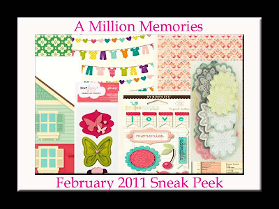
I know you have all been dying to know what Michelle has in store for the February kit. I know I have. Take a look at this little sneak she left us on the AMM Facebook page.

February AMM Kit Home is Where the Heart Is


Doesn't it look gorgeous? I can't wait to see what else she has in store for us. BTW if you have been missing all the talk from the message board we're chatting up a storm on the AMM facebook page in the discussions forum. Check it out here. We hope to see you there.

Little Something Sunday with Ro Philippsen

I think, like me, you all have a lot and lot of thickers, and others alphabets, where the numbers always to remain. 3 years ago, I think, I saw an intersting layout that used a lot of numbers. This layout never got out of my mind, and today I did one to look like that one.

Please don't ask me where or who did that layout,LOL, because I don't know... I remeber that I saw so quick and never saw it again!!


So, let's go to the idea to use a lot of numbers.


You can do a frame around de brackground, or can do a mat around your photo. Mix several colors and shapes. You'll be surprised with the result."

January Design Team Challenge Winner

We have a winner!! But first let's take a look at the sketch and the challenge one more time.


Here's Zoe's sketch:


and my challenge was to make a LO based on Zoe's sketch using the following color combo:


Now let's take a look at your entries:

"Hammin' it Up" by Christina Colon


"Everyday Play" by


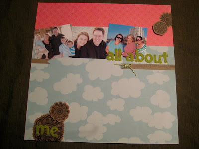
"All Abut Me" by Jennie M.


"Rotten" by Angel Rodrigue


"Art and Joy" by Rosangela Philippsen


Thank you so much to all of you who participated.

And finally the winner is .......................... Angel Rodrigue!!

Congratulations Angel.

AMM Store - What's New

Check out this gorgeous new line by Webster's Pages

Spring Market:


Guest Designer Reveal

I want to send out a big thank you to Suzy Plantamura for being our January guest designer. It sure has been a lot of fun. Take a look at these fabulous LO's she made using the January kit.


Make sure you give her a big AMM thank you and leave her some love.

Design Team Reveal

Are you ready to see what our designers have been up to this month?


I love this LO by Marie. The orange and the blue really compliment the pink and I love how she layered a few scraps of trim with that button.

"Me" by Marie Ramirez


This vibrant LO by Tonya is really cool. Love how she combined her journaling with her title and her use of the chipboard flowers and buttons.

"She'd Soar with the Birds" by Tonya Dirk


This one's by me. I really love all the bits and pieces included in this kit especially the cards and the trim. I decided to use the trim in place of paper strips to give my LO a little more texture.

"Southern Belle" by Jennifer Longencker


This next one is by our fabulous AMM owner. I love her grid pattern and how she layered the embellies.

"My Party Kids" by Michelle Quinn


And last but not least is this adorable LO from Staci. Love what she did with the vintage buttons on this one.

"Luckiest Baby Alive" by Staci Taylor

Design Team Challenge Update

It's time to check in and see where we are with our design team challenge. Let's take a look at the sketch and the challenge again real quick.


Here's the sketch:


And my challenge to you was to create a LO using this color combination:


Here's our second entry by Jennie M.


Thanks for participating Jennie. I love how you pulled out the brown in the color combo by using the Maya Road coasters.

You still have until the 21st to get your entries in. All you have to do is post a link to your LO in the comment section of this thread.