Little Something Sunday with Stacy Cohen

Valentine’s Day is just around corner, so if you haven’t already made your Valentine’s Day card, here’s a little something to help you out.

I made the heart pocket on this card using a great little template from The Paper Zone.

Here’s the template I used to create the heart:

Just trace, cut and fold as indicated, then attach the heart pocket to your card or other project. Fill it with whatever you’d like . . . flowers, a message, a greeting, a vintage image, a piece of ephemera, etc.

Have fun with it!

February Guest Designer Reveal

Say a big hello to our February Guest Designer, Suzy Plantamura! Suzy has guest designed for AMM in the past and we are so glad to have her back. So glad in fact, that she will be guest designing for us from February through April as an honorary design team member! So say a big hello to Suzy!

Suzy has designed for Love, elsie and currently designs for Me & My Big Ideas. She was also just named to the Creating Keepsakes Dream Team! Congratulations!

I stole a few pics of some recent layouts she has posted on her blog for you to get an idea of her fun, bright, and funky style, which will go perfectly with this February kit!
"Ice Paradise" (as seen in January Creating Keepsakes)


"Hoping for Snow" (as seen in the January Creating Keepsakes)

"Nailed by the Boys Once Again" (as seen on the Creating Keepsakes Blog)
You can check out more of Suzy's inspiration on her blog here or in her AMM gallery here.

February Kit Sneak

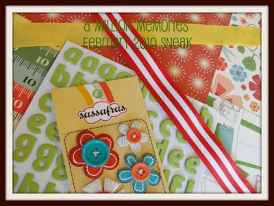
Have a peek at the February kit below. With brand new CHA product from Cosmo Cricket, Homefront papers from Studio Calico, and embellishments from Basic Grey, Sasafrass, and Maya Road, this kit is sure to brighten your February. Look for the full reveal on February first with design team projects to come soon after.


Want to snag one for yourself? Then click here to sign up for a subscription. It is the best way to save and be sure the kits keep coming!

Tutorial with Jeni Boisvert

I wanted to take a minute to share with you this project video from designer Jeni Boisvert. I fell in love with this unique necklace she made using materials from the January kit. In the video she will show just exactly how she made this beauty. So just click play and enjoy.


Thanks so much Jeni. You can see more of what the design team did with the January kit right here.

Weekly Gratitude

I wanted to take a moment to fill you in on a little project I have been following, which is hosted by AMM member Lori Gentile and AMM designer, Karen Grunberg. It is called Weekly Gratitude and is such an amazing project.

Having recently taught a month long journaling class focused on journaling your thankfulness this project really caught my attention. the basic jist is to reflect more consciously on the people, things, and areas in your life for which you are thankful. Each month a specific theme is provided only as a means of inspiring some thoughts. This month's theme is work.

These ladies share their projects, give prompts and so on via a blog which you can find here. For my project I am creating a weekly journal card from these downloads provided on the website.

Here is my journal card for the first week of 2010.
This is my journal card for the second week of 2010.
I plan to put all of the cards together into a little 4x6 photo album when I find one I like. I am really enjoying this project because it is helping me to have to think about thankfulness and gratitude every day which is a really positive feeling.


I have added this widget to my blog linked to their site and you can too. I have also added it to the AMM blog sidebar in case you would like to link from here. I hope you will join in and share with us in the gallery.

Technique Tuesday with Sasha Holloway

Paper Weights
1. Cut paper to size and fold as if you are wrapping a present. Seal it with your favorite adhesive.
2. Use your Cricut or die cutting machine to make dimensional shapes out of the same paper you used to make your present box. If you do not have a die cutting machine you can use whatever you prefer to make the dimensions of your choice.
3. Decorate and use as weights.


So cute! I love the text printed one the best!

Member Monday with Sasha Holloway

Welcome to a new Member Monday with Sasha Holloway. This week Sasha has chosen the layout below by Leeann Pearce. Sasha said, "I think this layout is simply adorable. I love the texture of it using the denim and paint. It is amazing with all of the photos. I love that she took a chance on her layout with so many photos and little things going on. Your eyes still follow the story."

"Snaps" Leeann Pearce

Here's a little interview Sasha did with Leeann. Read on to learn more about her.
1. What was your vision behind creating the layout? It’s all about the “Pac Man” embellishments. I wanted to recreate the game, plus I knew that I wanted to use lots of smaller photos. I googled the game and had a bit of a play while I was there. “Patching”, that’s what came into my head and then I knew it had to be highlighted in some way. That’s the stitching and the buttons are the dots that the pac man eats. The photos had to be totally cute and fun of course.

2. Are you a freelance scrapper or do you have to have a sketch or something in front of you to begin? I am free, but lately I find that I am inspired by what is on display in shop fronts. It’s the textures and materials that are grabbing me, not so much the arrangement. It's what they are throwing together that makes me think about the textures and materials. Totally mixing and not matching. But yet it works!!!

3. What is your favorite technique or product you just have to use on your layouts? Stitching. You can almost do anything you like. I love to use it randomly. It's always the finishing touch with a lot of my layouts. I love that you can mix it up by simply using 2 different coloured threads or even if you just pick at it for a more distressed look.
I love buttons simply because they come in so many different sizes, colours, textures, etc. I love to make my own buttons and make them” BIG” so that they pop off the page.

4. Your layouts are so free and colorful is that your favorite thing to use in layouts, tons of color? I love colour and love splashing it around. It brightens my day, it sets the mood. I love how the girls look through the albums and talk about the little details and the colour and how it makes them feel. They also can recall the events and places. Holly is reading well so she gets that little bit more from the page than Storm, but with Storm she will go and recreate what I have done and she too splashes colour everywhere!
Thanks Sasha and Leeann. Be sure to leave Leeann some love on this post and check out her gallery to get more inspiration.

Little Something Sunday with Larissa Albernaz

Pop Up Valentine
As a valentine project, I´ll give some tips to make this pop-up vintage card.


A pop-up card is just a three-dimensional paper structure formed by the action of opening a crease. It becomes dimensional through the use of different mechanisms. When it´s closed, the card lies flat and can be easily stored and mailed. When the card stands up, the elements move forward by a piece of paper on the bottom of an image that is folded and adhered onto a base.

It´s not necessary, though, that the card lies flat. You can use your imagination and make it as a three-dimensional piece to decorate your home.

Supply list:
Craft knife
Scissors
Paper trimmer
White cardstock
Patterned paper ( Pink Paislee Cupid Collection - Hearts Bloom; Bow & Arrow and Postcards)
Paper elements
Hot glue gun
Foam or glue dots
Pearls
Glitter stickles
Prima flowers
Beads
Feathers, laces, etc.

Instructions:
1. First, print and cut out paper elements using a craft knife or scissors.
2. Apply glitter and set aside.
3. Prepare you card base by cutting a 6" x 10" strip of white cardstock and a 5.5" x 4.5" piece of paper from Pink Paislee "Bow & Arrow".
4. Fold white cardstock in half. Adhere your Pink Paislee paper to the white cardstock.


5. Glue your background image to your card base using foam dots.


6. Adhere feather to the heart and attach your first tab.


7. Attach other paper elements to the base using tabs.


You can find the patterned paper Larissa used for this unique card in the store here. Thanks for sharing Larissa!

January Design Team Reveal-The Die Cut

Probably my favorite part of the January Kit was this die cut paper by Basic Grey from the "Origins" collection. However, this paper isn't really a die cut. It is actually a 12x12 piece of paper, square shaped, with a pattern on the back. The black and cream side just lends itself to becoming a die cut shaped paper.

So let's take a look at the ways the design team put this great paper to use.

First up is this incredibly creative design by Jeni Boisvert. She cut off the tips of the design and flipped two of them to reveal the pattern on the backside (the yellow) and then regrouped them to form a unique base for her layout.
"The Wonder Years" by Jeni Boisvert

Next up is Karen, who inspired my layout. She cut around the border of the black and cream shape in the paper and then traced this onto the cardstock and attached the two halves, thus saving the other half of the paper for later projects and creating a unique design.
"You Will Never Be Alone" by Karen Grunberg


Next is this design by Larissa who cut around the shape and used the whole thing for her background in this stunning design. A piece of the Webster's paper forms the center of the layout and a place for her to place her pictures and other embellishments.
"Girly" by Larissa Albernaz
Here is my layout where you can see how I was inspired by Karen's creative design. However, I added a band of the Webster's patterned paper vertically across the layout to break up the design a little bit and added color.
"Engaged" by Jennifer Findlay

Next we have this gorgeous nearly monochromatic layout from Stacy Cohen. The pops of red really stand out. Like Larissa, she cut out the design and used it as the base for her layout creating a really striking design.
"Moment" by Stacy Cohen


Lastly, we have this creation from Tonya Dirk. She cut the shape from the paper and used it as the top half of this layout. The bottom half is the other half and backside of the patterned paper. She joined the two together with the Hambly doily paper and some beautiful lace.
"You Take My Breath Away by Tonya Dirk
That is it for my sharing of the January Kit layouts. You can see more of the design team's wok with the kit in the gallery here. You can also still pick up a January kit here.

Design Team Challenge with Karen Grunberg

Today we are going to take a look at a couple layouts from people who participated in Karen's "Use Your Words" design team challenge. The challenge, which runs through this Saturday, is to create a layout where the journaling is the focus.

When asked how she incorporates so much heart felt journaling on her layouts, Karen said, "I always do my journaling first. I pick my photos, my stories and then I write them down. Then I sit to do the layout. in the BPS class I teach this is one of the first things I tell my class, if you want to write better and more, promote the journaling to be a first class citizen by doing it first and not as an afterthought. it's my opinion of course, i am sure many others have other systems. this is what works for me."

First up is this layout by AMM member, Tagnia Clark. This layout is about the youth pastor at her church who recently left after 17 years of service. She created this layout as a tribute to him.
"Thank You" by Tagnia Clark


This next layout is by design team member Kat Glossop. Kat not only journaled, but the second part of the challenge was to use an imperfect photo.
"World of Laughter" by Kat Glossop


If you would like to participate, be sure to upload your entry to the thread here and the gallery by Saturday. A new challenge will be coming on Sunday from Jeni Boisvert, so check the Challenges forum next week.

Technique Tuesday with Tonya Dirk

Today's Technique Tuesday comes yo us from Design Team Coordinator, Tonya Dirk, who is going to share with us some glitter techniques in the video below. Just push play!


Here's a closeup look at the layout Tonya was working on.


Thanks so much Tonya!

Member Monday with Stacy Cohen

This week's Layout of the Week was chosen by Stacy Cohen. She chose the layout below by Maria Swiatkowski. Stacy said she chose this layout because, "I love the clean lines and crisp design of Maria’s layout. The fun title and the circles accent her page perfectly! But I have to say, it was that super adorable photo that first caught my eye."

“Goofy Little Rooster”


Stacy caught up with Maria to ask her a few questions and help us all get to know this AMM girl a little better.

Stacy: How long have you’ve been active on the AMM boards?
Maria: I joined July 2008. And haven't left! I was a late bloomer in joining the online scrapbooking "world." Prior to joining AMM, I didn't belong to or really even read online scrapbook sites.

Stacy: What were your three favorite paper lines in 2009?
Maria: Basic Grey Lemonade, Pink Paislee Amber Road and October Afternoon Very Merry collections make me smile.

Stacy: How long does it usually take you to complete a layout?
Maria: Most of the time it takes me a couple hours, but I rarely get a two-hour window to scrapbook in. I just work on layouts in short bursts of time. The "Goofy Rooster" layout was a quickie, probably start to finish, only an hour. That's definitely an exception to my norm.

Stacy: If you stopped buying scrapbooking supplies all together, how long could you keep scrapping with your current stash of supplies?
Maria: Gosh, do I have to admit this?? I could probably last a year. I would need cardstock and adhesive eventually, but I have enough patterned paper and Thickers to last a long time!

Stacy: What do you have on in the background while you scrap – music, TV or nothing?
Maria: When scrapping, I like to put my Ipod on. I have a little of everything on there and just put it on shuffle.

Thanks so much Stacy and Maria. Be sure to show some love for Maria and leave a comment on this post here. You can get more inspiration by checking out Maria's full AMM gallery here.

Little Something Sunday with Rachel Hall

Valentines Mobile/Display Piece

This project is the perfect project to make to show off all of the love in your life! It is also great for using up all of those chipboard shapes and scraps you have lying around.
To create this project:
1. Paint or cover with paper your chipboard shapes front and back.

2. Embellish however you like, I used stamps, flowers, rhinestones and pen-stitching.

3. Print pictures of the people and things that you love.

4. Glue two pictures back to back for each photo in your piece.

5. Decide how you would like your pieces to be arranged.

6. Punch holes where needed.

7. Begin to attach pieces together using string, ribbon or wire (I used wire). You can add buttons and ribbon in between all of your elements if you like as well.

8. Attach all pieces to a hanger (I used a pants hanger that I added patterned paper and chipboard letters to).

9. Tie a big piece of netting or ribbon around the hanger.

10. Hang up your piece and enjoy!

You're Going To Love These!

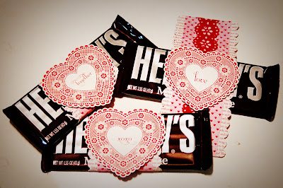
Valentines Candy Bar Wraps

Supplies:
Candy bars
Patterned paper-such as the new Valentines Making Memories now in the store!
Border and lace punches of your choosing
adhesive

To Create Wraps:
1. Cut your patterned paper into strips the width desired for your wrap. I chose to cut mine at 3 1/4" and 2" for the largest two layers.

2. Cut each strip to approximately 6 1/2" long for a standard size Hershey's bar.

3. Using your border punch, punch the edge of each side of your widest paper.

4. Adhere your 2" wide piece on top of the one that you just punched the edges of.

5. Using your border or lace punch, punch out your thinnest top layer.

6. Adhere to other pieces.

7. Using either a cut out piece of patterned paper or another type of embellishment, embellish the tops of your wraps. These new additions to the store would be perfect for this project!


Love Struck Shop Hearts


8. Wrap around candy bar and adhere. These are perfect for your special valentines!

Remember, you can take 27% off your purchases in the shop by using the code 2527 at checkout! (Excludes Monthly Kits)

Gallery Trends-Cards

I will be the first to admit that I really struggle with making cards. I usually look to online galleries for inspiration and most of the time end up copying the design of someone else. I first spotted this gallery trend with the January kit when both Sasha and Jeni made these pretty cards with the kit.

"Hi" by Sasha Holloway

"Joy Card" by Jeni Boisvert


As the month has gone on I have been seeing more and more cards and am just in awe of the great talent we have for cards in our AMM gallery so let's take a look at what some of our members have created.

Most recently was this card set by "scrappyTara" using papers from Pink Paislee's "Cupid" line. "Gimme Some Sugar" by scrappyTara


Next is this gorgeous winter wishes card y Andrea A. Even the picture of the card is beautiful!
"Winter Wishes" by Andrea A


I love this line of papers from Basic Grey's "Nook & Pantry". This card was created by the sweet Meg Giroux.
"For You" by Meg Giroux


This really cute baby card is by Charity Hassel. This is just the type of card that would be so easy to recreate and just add a different sentiment across the middle.
"Baby Girl" by Charity Hassel


These cards are so cute and creative and I love the puns they use! These were created by "dannisdoodles", aka Danni Reid.

"You Drive Me Crazy" By Danni Reid
inside reads: va va vrooooom!


"beep boop blip" by Danni Reid
inside reads: that's "robot" for happy valentine's day!


"love u love u love u" by Danni Reid
inside reads: a whole 'bot!


Lastly is this card by the ridiculously talented Anabelle O'Malley. Her cards always blow me away. My sister is getting married this year and this card would be perfect, so send it on my way Anabelle!
"Congratulations" by Anabelle O'Malley


Hope this helps you get your card making mojo flowing and keep posting those cards for a card challenged girl!

January Sketch Layouts

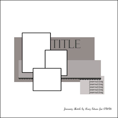
Today we are going to take a peek at what the design team did with the sketch designed by Lucy Edson.

Here's the sketch.


First is Tonya Dirk's interpretation. Not only do I love the paint splatters, but Tonya eliminated a photo and replaced it with a title block to make it work for her.
"O-gurt" by Tonya Dirk

Next is this pictureless layout from Sasha Holloway. I love her use of the Webster's fabric swatches as the focus instead of an embellishment.
"So Many Changes: by Sasha Holloway

"Scenes from the Mall" by Jennifer Findlay To make the Thickers work for my layout, I peeled the glittered tops off, painted them, then put Glossy Accents over top.

"Soar" by Stacy Cohen Stacy added more pictures in a band that stretches across the page but the real highlight here are the beautiful clouds and balloons at the top of the page. Gorgeous work!
Next is this layout from Jeni Boisvert. I love that she didn't take eh sketch too literally and centered all of her elements on the page.
"You Make Life More Beautiful" by Jeni Boisvert
To see more work from the design team using January's kit check out the Design Gallery here.